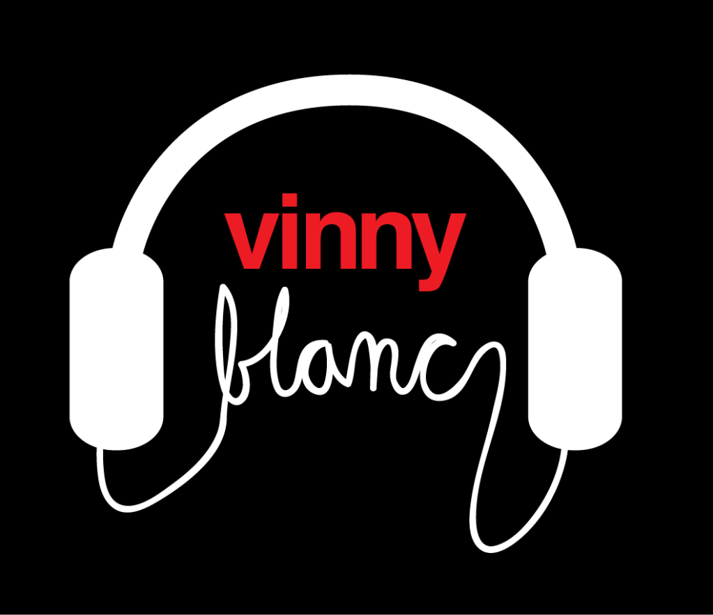
VinnyBlanc, post: 12332, member: 737 wrote: I sketched this and had a friend draft this up for me the other day.
Any thoughts (either negative or positive) for me before I go back to her with thoughts for a second draft?
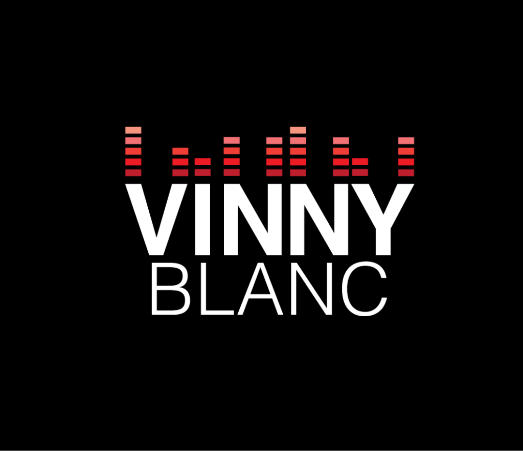
My thoughts are to potentially…
1. Change the color to either all black or two tone red and black
2. Layer this text over black lettering to add a little more dimention
3. Possibly turn the dot in the “i” into a play button…
Don’t forget this was the original logo I was going with, but I think I have ruled that out unless anyone thinks otherwise…
Both are very, very nice and “pro” looking……I prefer the headphones one as the “meters” one seems to be too generic, I cant remember how may music sites, dj profiles, labels online shops have similar logos!
The “headphones” even though some said are overused, for me personally are way more unique due to that “cable'” ! 😉
Well nothing is set in stone yet…I’m gonna try them both out and see what grows on me.
Next up …call in some favors from my photographer friends to snap some nice shots.
VinnyBlanc, I think you should top the i with a white “stop” symbol and a white “play” symbol above that, and change your font to westminster, just a thought. But the red going to lighter is cool because it resembles the NS6.
Both seem a bit Cliche. They are both very profesional but don’t seem personal. Would look good on a business card or a signature but if you going to make it a decal for your laptop then I would go back the original design
.