Home 2023 Forums The DJ Booth New DJ Logo Thoughts please

Viewing 15 posts - 1 through 15 (of 24 total)
  • Author
    Posts
  • #12321
    Phil Morse
    Keymaster

    I like it! I’d keep it one colour.

    #12329
    IznremiX
    Participant

    pretty cool man, i like the idea of changing the i to a play button too

    #12341
    VinnyBlanc
    Participant

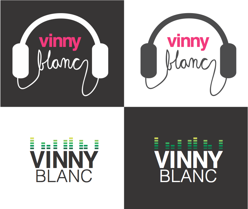
    I have gotten some feedback that if you didn’t know it was supposed to say VINNY BLANC it may be a little unclear (especially with the c and y on the end)
    Should I have her put a small space to break the “C” off a little from the Y?

    I’m def going to have her add in the play button on the i.

    #12349
    Dj EarGazm
    Member

    I would keep it man. it looks good. with them connected it keeps it looking like it was made in word. I get the same questions about my logo but having them connected gives it a stand out look. I see it as when people question it, they are looking longer at it which makes them remember it. I’ve gotten “what is it?” all the time but once they see it, they compliment the look of it

    #1002510
    VinnyBlanc
    Participant

    Thanks for the feeback EAR. Thoughts on switching the dot in the “i” out for a play button?

    #12356
    Dj EarGazm
    Member

    if the “play” will look like the rest of the font, it would look good. but either way it looks good

    #12377
    FileSpnr
    Member

    Can you work the play button into the C somehow. It’s like my brain wants to see something there

    #12713
    softcore
    Member

    The long i can also confuse the reader: “Vinny Bianc”. Just saying….

    #12718
    VinnyBlanc
    Participant

    Softcore,

    Thanks for the feedback. Do you think a slight gap between the i / l would help resolve this.
    What are your thoughts with the unclarity of the “y” wrapping into the c? I could also add a small break in there.
    Problem is, if I start chopping it up it may end up looking like it was done in word with a regular font and lose its flair.

    #12733
    softcore
    Member

    ……tough one..truth is, aesthetically speaking I like the fact they are connected………thinking……I’ll be back! 😉

    #12831
    softcore
    Member

    Hmmmm, just an idea….what if you “extend” the second “N” of Vinny to reach and be the “N” of Blanc too? ….and make the i and l disconnected. After all there are too many Ns in there. This way you ‘ll have the away-from-generic feel you want and still make the i,l, y, and c disconnected.

    #13781
    VinnyBlanc
    Participant

    okay I had another friend of mine totally shake it up and I have some additional options.
    The pink would be replaced with red text and the green volume bars would be redone in a red scheme.
    Also the grey would be replaced with black giving me a black/red/white theme either way

    Thoughts please?

    #13794
    Dayvue
    Member

    The bottom-right one is the best, IMO. I wouldn’t go with the headphones since everyone and their uncle does too.

    #1002787
    VinnyBlanc
    Participant

    I’m actually having her redo the bottom right one with a true black background and red scheme for the bars. Any other suggestions on that specific logo as I am leaning toward that one.

    #13800
    Arthur Kokanov
    Participant

    I really like both… and i think you can use both the one on top has a funk/house/hiphop feel where as the one below has a techno/trance/

Viewing 15 posts - 1 through 15 (of 24 total)
  • The forum ‘The DJ Booth’ is closed to new topics and replies.